An author with the delightfully sonorous surname "Schmiegelow" has published a paper in The Journal of the American Heart Association on the relation between obesity, metabolic abnormalities and increased CVD risk across various ethnic/racial groups of post-menopausal women in the WHI data. The authors use Cox models to estimate associations between risk factors and first CVD events over 13 years of follow-up.
The results suggest some heterogeneity in the impact of BMI by race among those with no metabolic syndrome:
Among black women without metabolic syndrome, overweight was still associated with outcomes (HR=1.49), but not among white women without metabolic syndrome (HR=0.92, heterogeneity p-value 0.05).
Likewise for obesity in the absence of metabolic syndrome, black women had a stronger relationship than white women (HR=1.95 versus HR=1.07, heterogeneity p-value = 0.02). Finally, overweight and obese women with ≤1 metabolic abnormality did not have increased CVD risk in any racial category, supporting the "fat but fit" hypothesis.
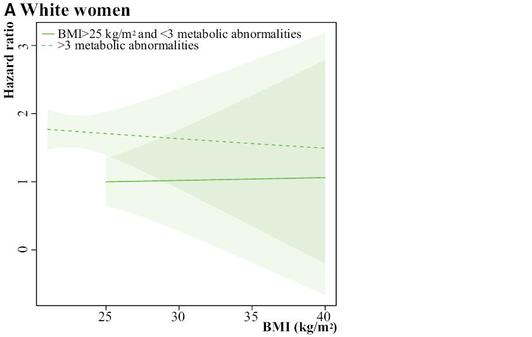
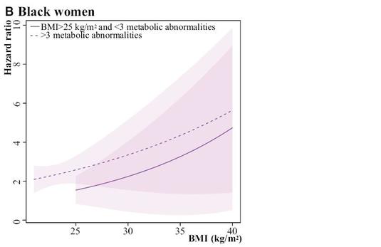
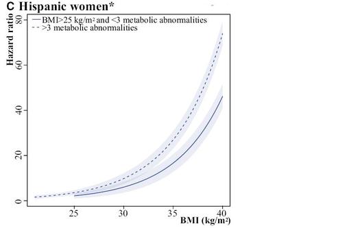
This is all fine, but my question is: what is up with Figure 5? The legend says: "The shaded regions around the lines gives [sic] the 95% confidence band, the standard error, for the mean." I don't really understand that sentence, grammatically. The authors then write: "Please note that the scale of the y-axis differs for white (0 to 3), black (0 to 10), and Hispanic (0 to 80) women, so the widths of the CIs are not comparable."
First of all, how can the Hispanic women with BMI=40 have an HR=80? That is a bit suspicious, to say the least. Then, about the confidence interval widths, I get that the vertical scale is different, but nonetheless:
For black women at BMI = 40 and > 3 abnormalities, HR = 5, 95% CI = 1,10 (10 fold wide)
For Hispanic women at BMI = 40 and > 3 abnormalities, HR = 75, 95% CI = 70,80 (1.5 fold wide)
So Hispanic women are about 10x more precise, despite being the smallest group in the study (6700 whites, 5100 blacks, and 2500 Hispanics).
Could this be the first hint that the WHI data are all completely fabricated?


 RSS Feed